
Library Web Application

The Brief: design a responsive web application that will strengthen a library’s relationship with the community it serves. The solution must be grounded in primary user research.
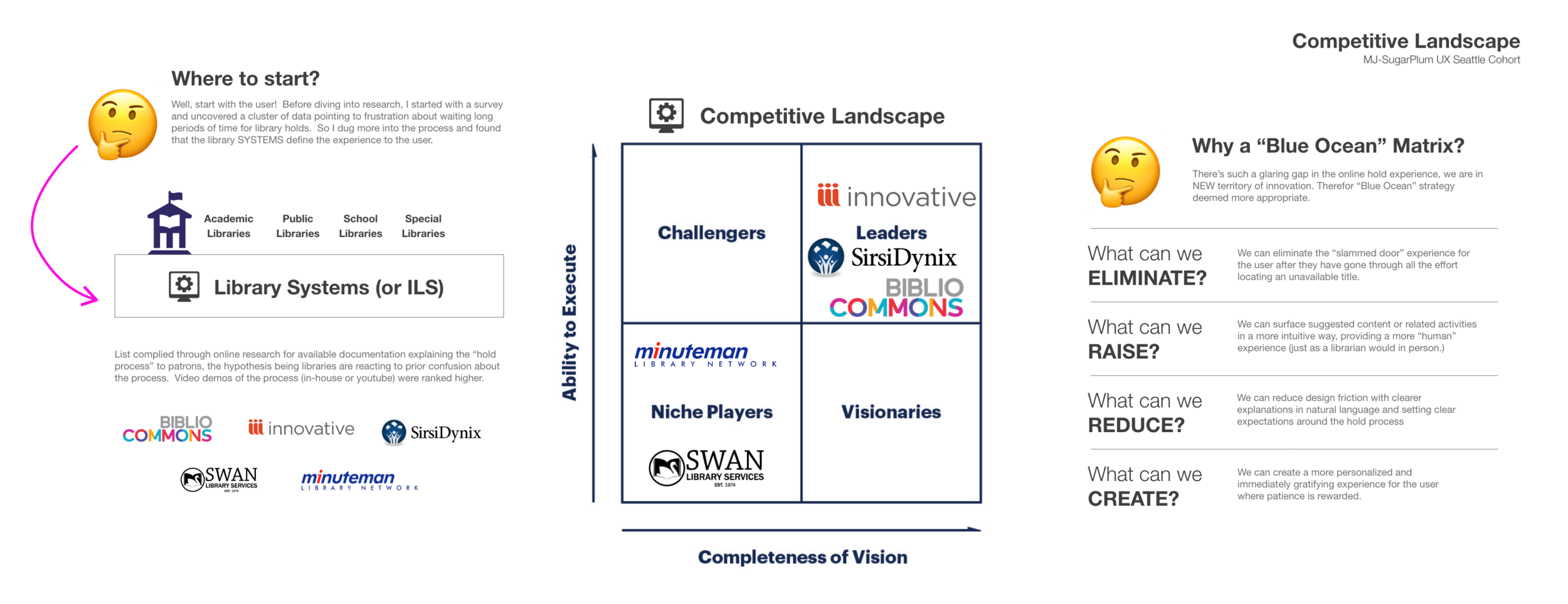
Domain Research & Competitive Analysis
Maintaining a Human-Centered design approach, I started with user research to guide this analysis, first researching the underlying systems with available documentation. Only after I understood this landscape did I move on to aesthetics and content auditing, therefore providing the best examples that combine both "form and function" as pertaining to the hold/waitlisting experience.


User Research
Subject Matter Expert Interviews
Insights from SME interviews: Common theme was lack of awareness of offerings/services among patrons. Half of librarians mentioned an interest VR technology, and lack of physical meeting space for patrons. The assumption for local libraries to provide career resources to the community is not shared in Scotland.
Opportunity: “How might we“ increase awareness of library offerings available?
Personas / Archetypes


Problem Statement
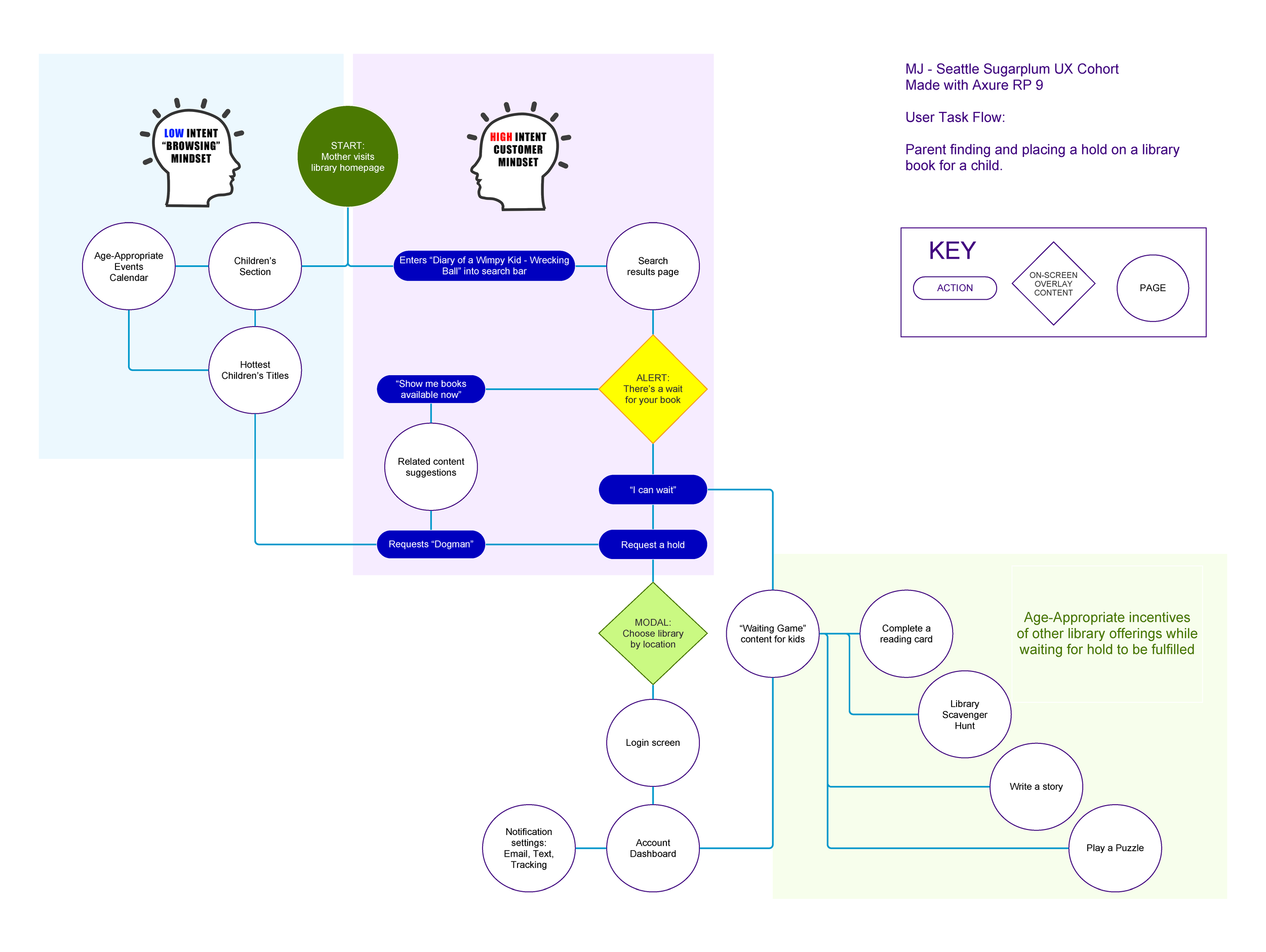
User Goal: for parent to locate and reserve library book for child.
Parents and children want to check out the hottest kid’s book, but become discouraged when they realize there is a long waitlist and become frustrated when it’s not apparent how long their wait will be. They need a more intuitive online experience that anticipates this friction with suggested content that rewards the child’s patience and provides opportunities to deepen their relationship with the library.


Paper Prototype
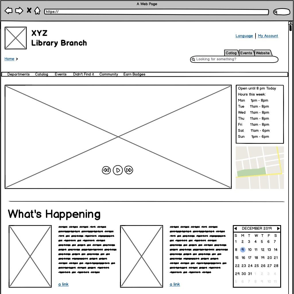
Basalmiq Prototype
Findings:
50% split between browsing and direct search
50% chose puzzles as a badge activity
100% of users were interested in learning more about the badges
IA / Navigation
“Departments” is a confusing label and 75% of users missed it
Recommendation: A/B testing with alternate label such as “sections” (similar to e-commerce sites)
Earn badges should probably be combined with Events under a new tab called "Activities"
Recommendation: Future A/B testing with different navigation layout
IA / Features
Default library should be more predominant on the modal, so people don't have to go through additional steps unnecessarily.
"Add to List" button was a confusing feature (possibly due to positioning ahead of "place a hold")
