
Background
- User-centered design initiative leveraging a gamified approach to replace traditional medical binders with an engaging, interactive health diary platform.
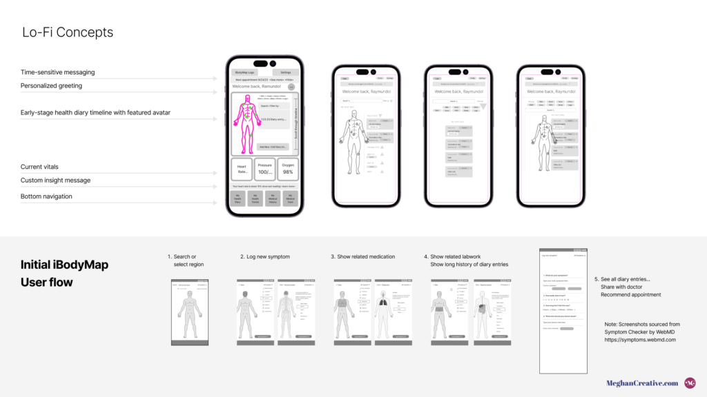
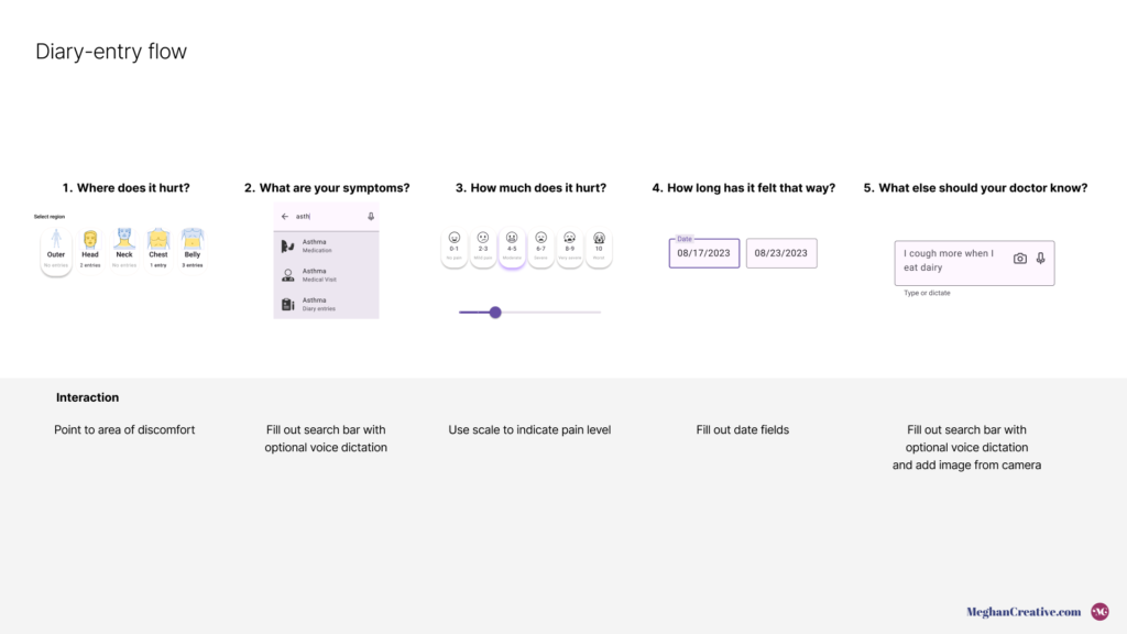
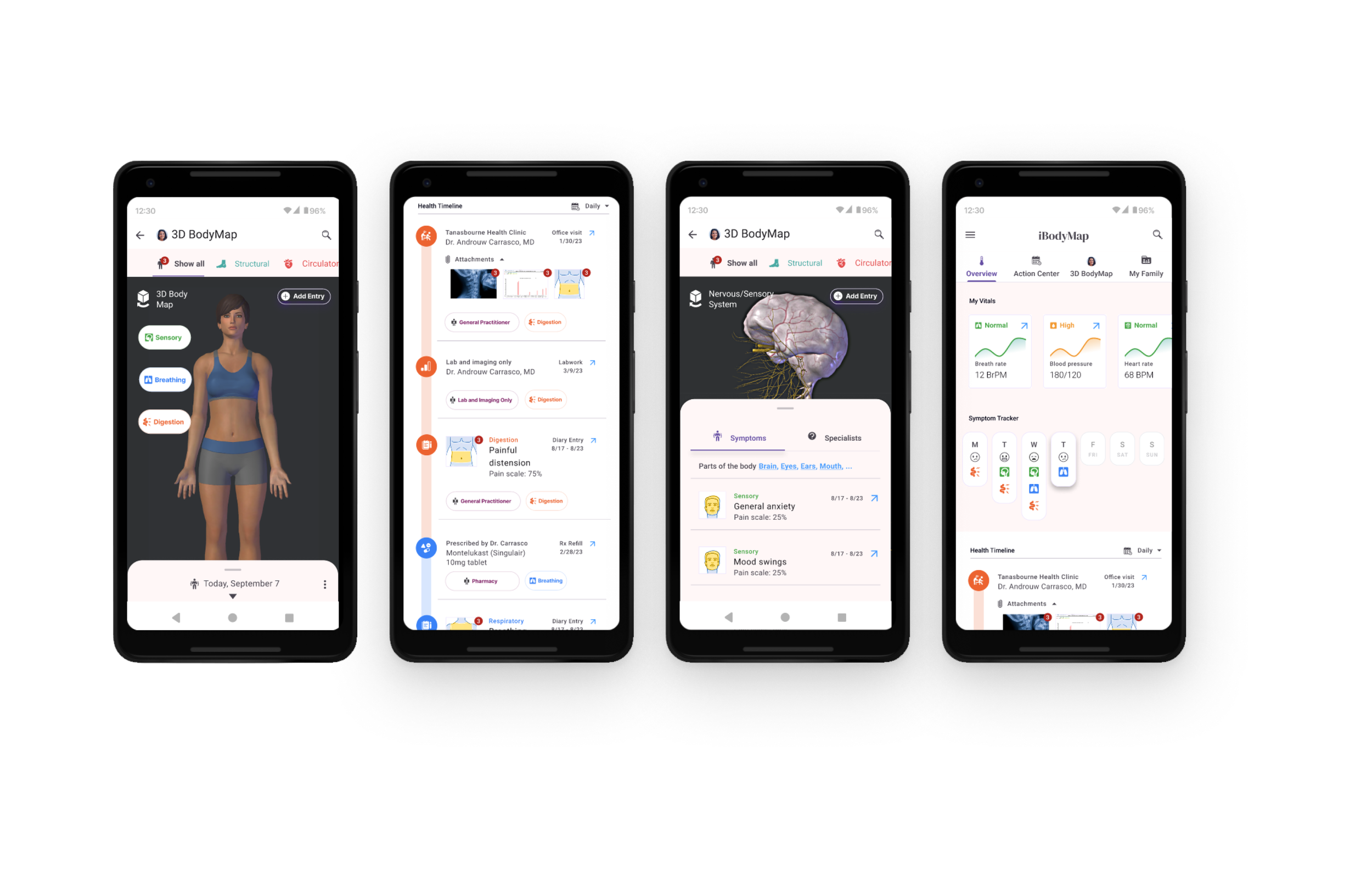
- Features an interactive medical avatar and integrated record diary to make health tracking visual.
Focus
- Project leadership, comprehensive user research, design strategy, experience design, visual design, prototyping, and usability testing.
- Design thinking strategy utilizing tools like Figma, Maze.co, and Otter.ai.
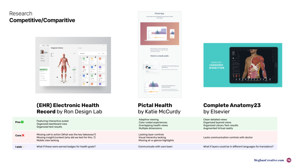
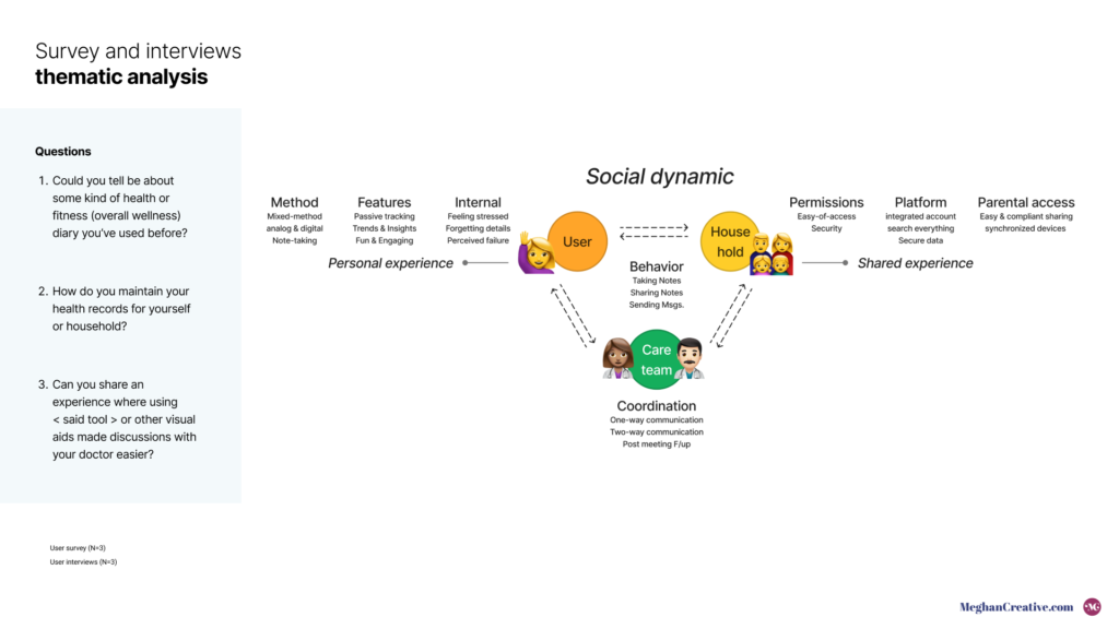
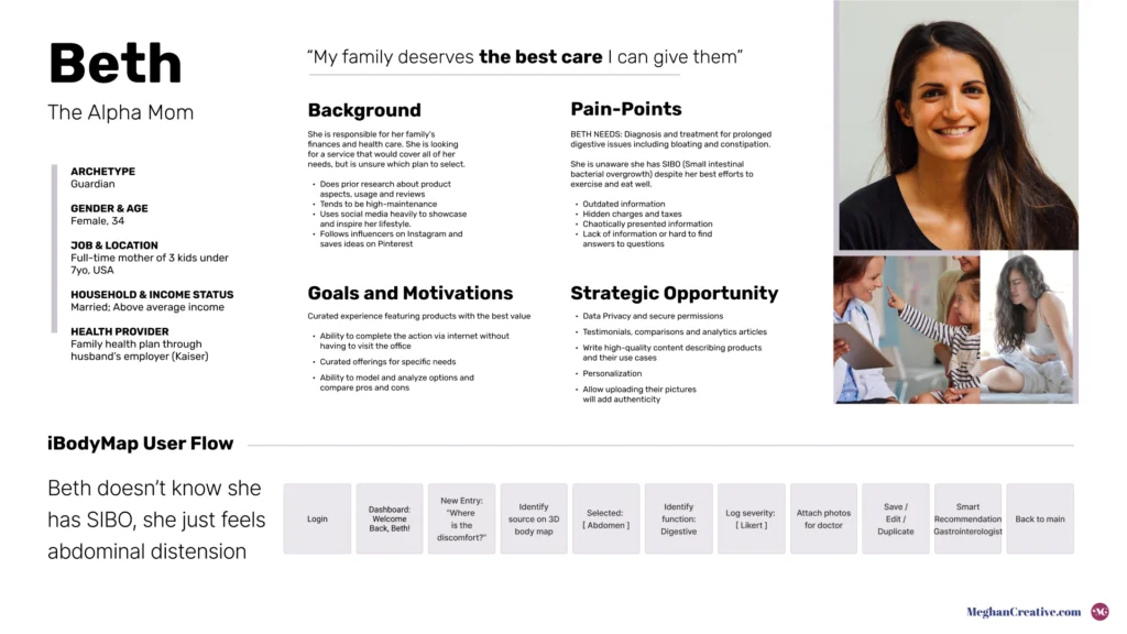
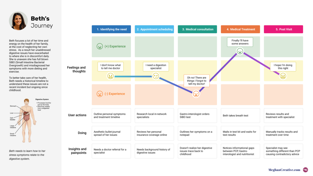
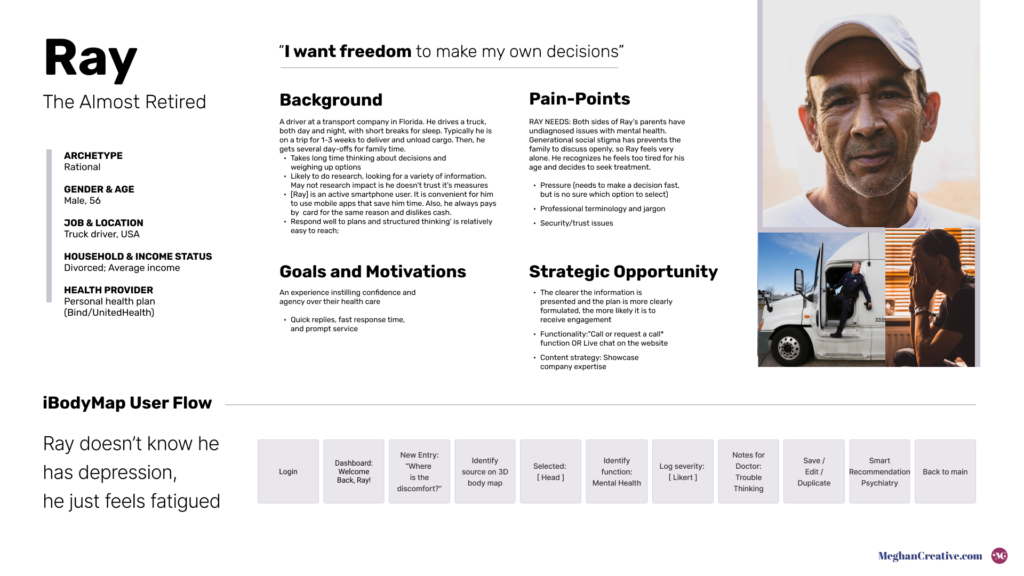
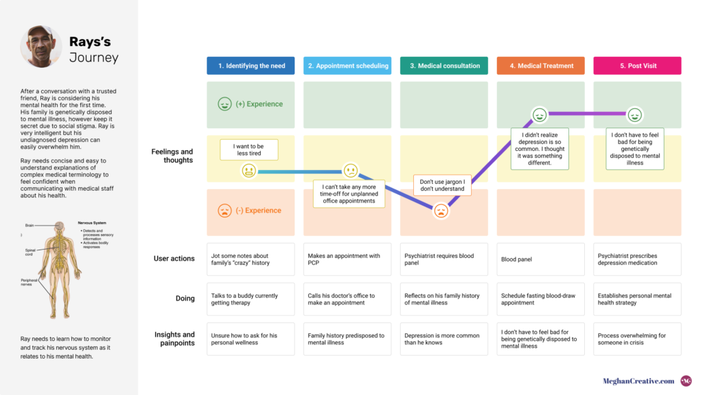
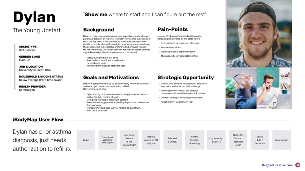
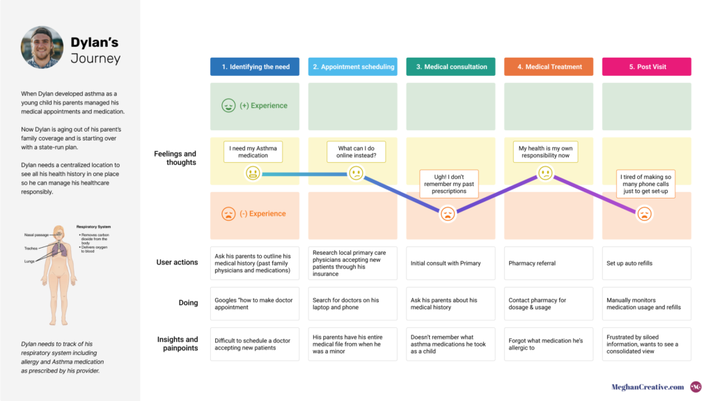
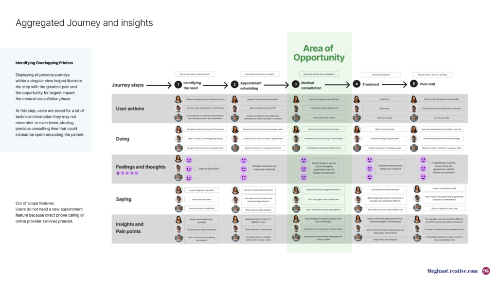
- Methods included empathy interviews, journey mapping, and comparative analysis.
Purpose
- Tackled challenges of medical data accessibility, user engagement with health apps, and seamless sharing of health data.
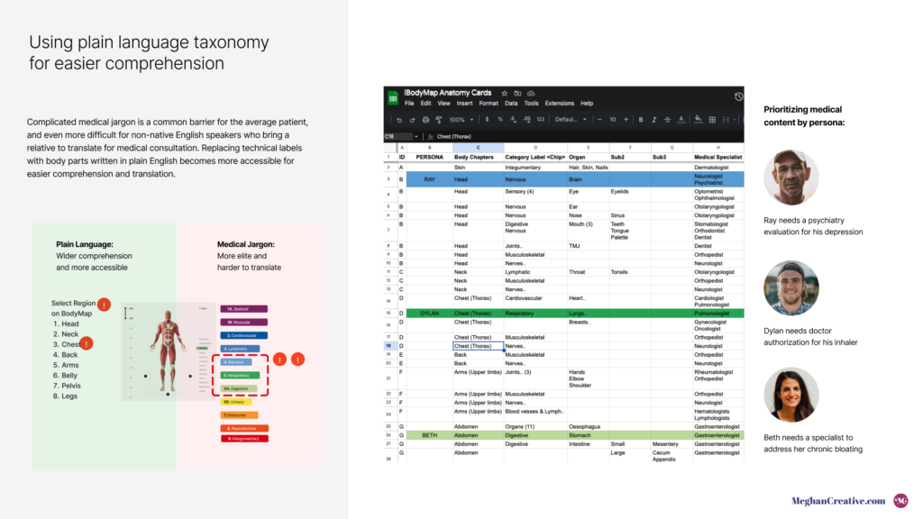
- Simplified user pain points related to managing health records and understanding medical jargon visually.
- Focused on ensuring data is stored on personal devices and providing comprehensive monitoring features.
Role
- Solely managed all aspects of design, research, prototyping, and usability testing.
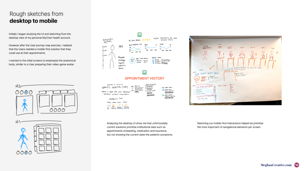
- Made critical decisions such as redefining solution formats based on journey map insights and navigating constraints to focus on core functionalities.
Scope
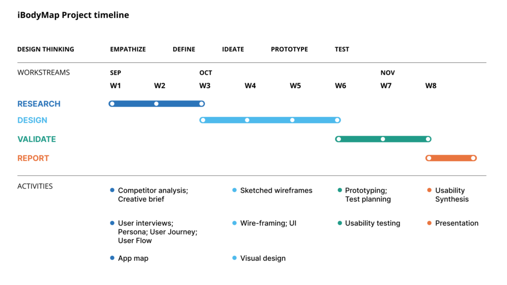
- Completed in 8 weeks.
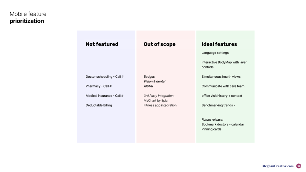
- Faced constraints and trade-offs such as excluding advanced features like AR/VR views and third-party integrations due to time and resource limits.
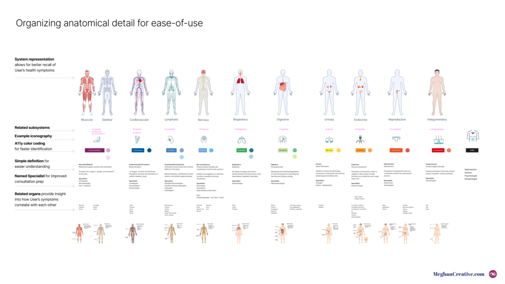
- Addressed unexpected challenges like the complexity of simplifying body systems by allocating additional time to tangible goals within scope.
Process
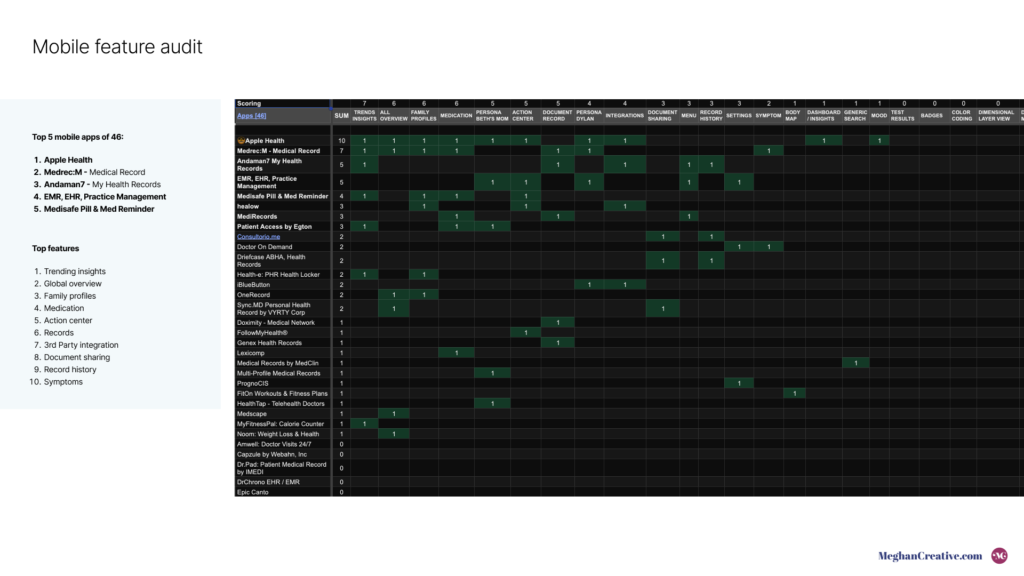
- Research & Discovery: Engaged users in empathy interviews and surveys (minimum 3 participants) and conducted competitive analysis to identify struggles with app engagement and friction at doctor visits.
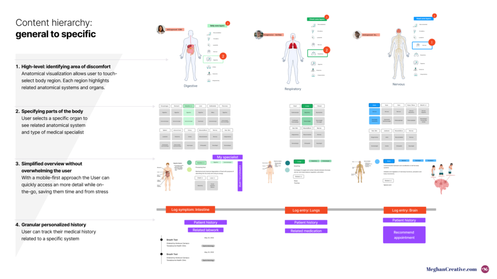
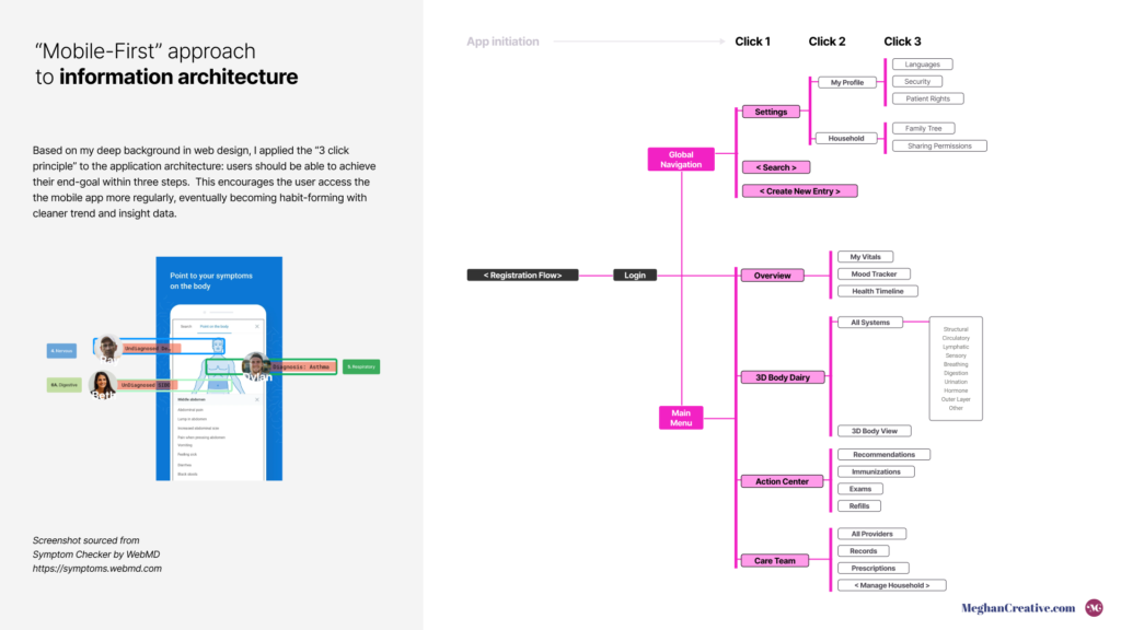
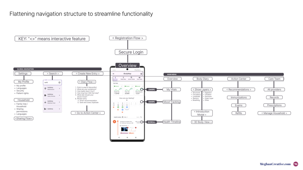
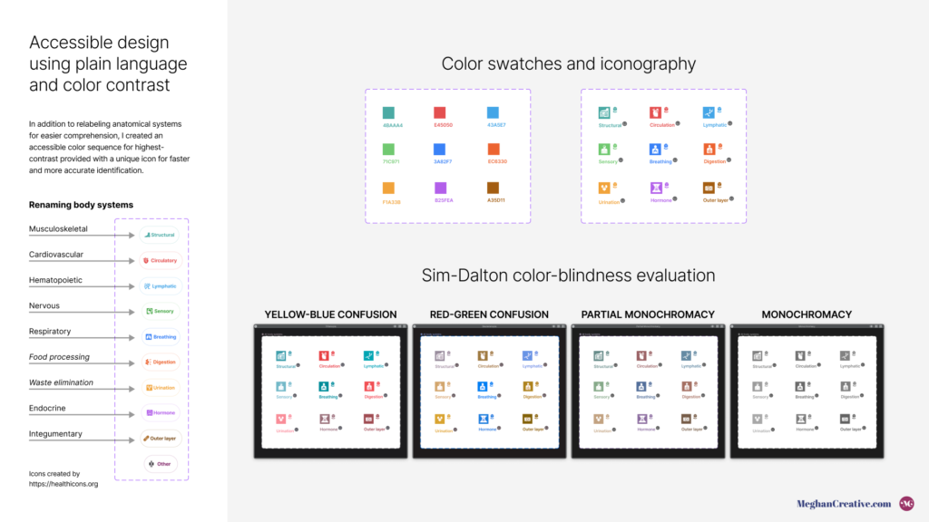
- Design Strategy: Redefined information architecture around user-friendly elements, emphasizing simplified language and ease of data sharing.
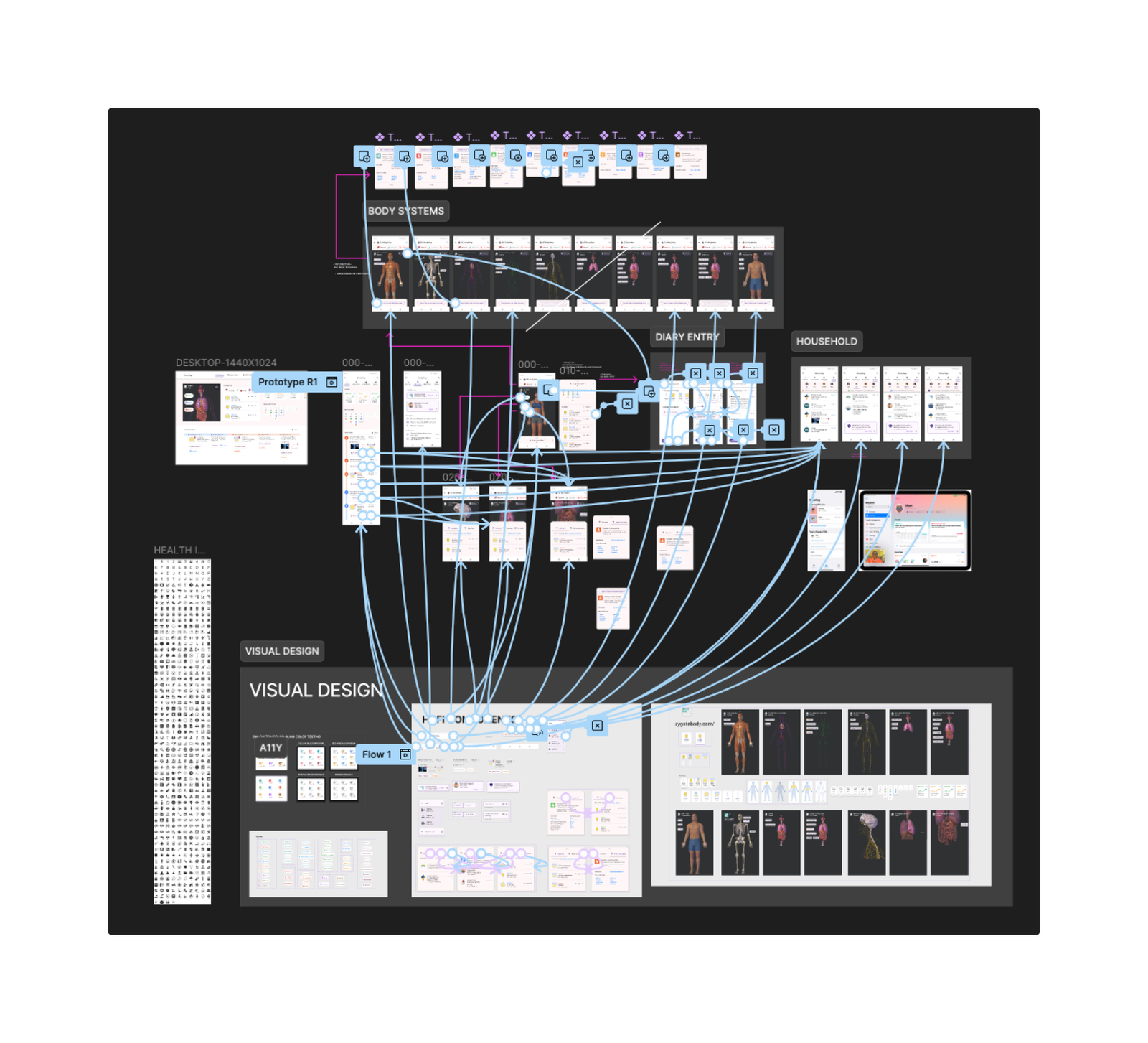
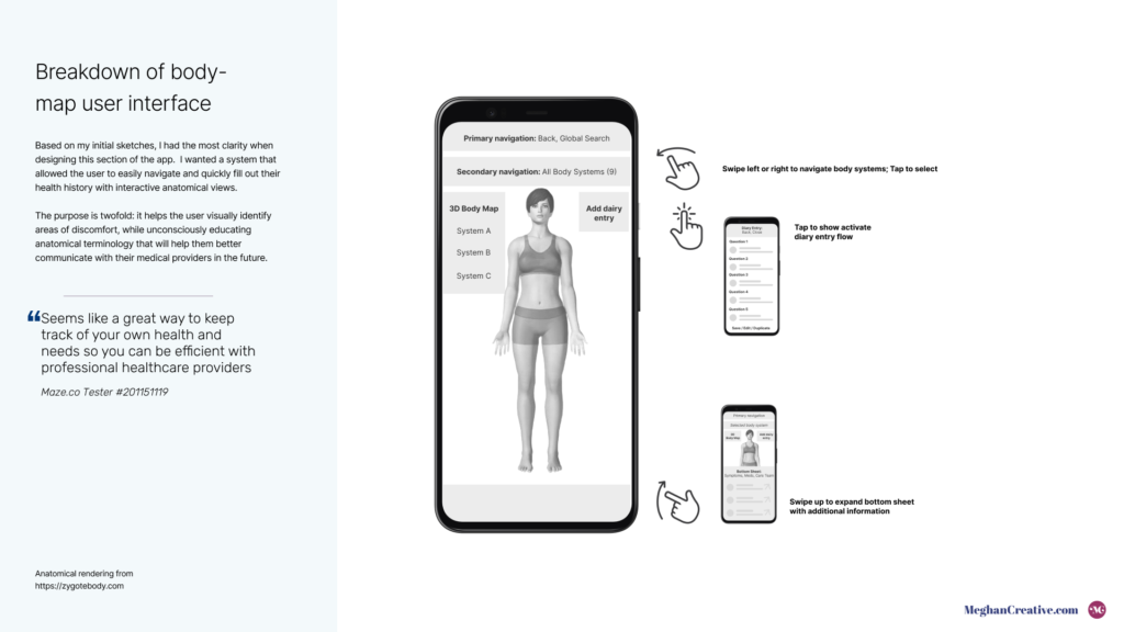
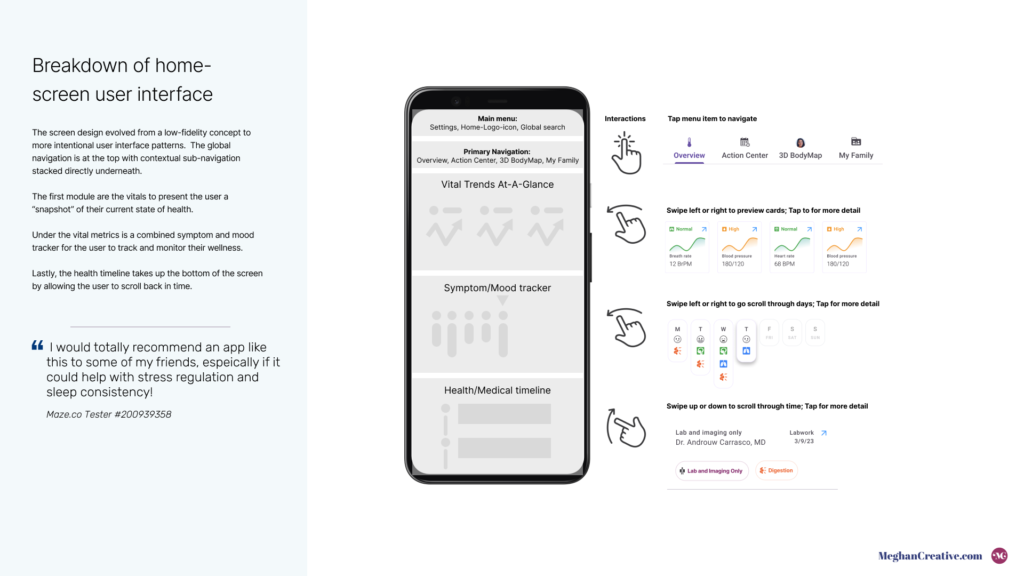
- Experience Design: Developed user-friendly interactive prototypes and refined navigation to enhance usability.
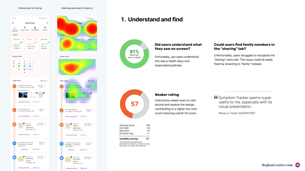
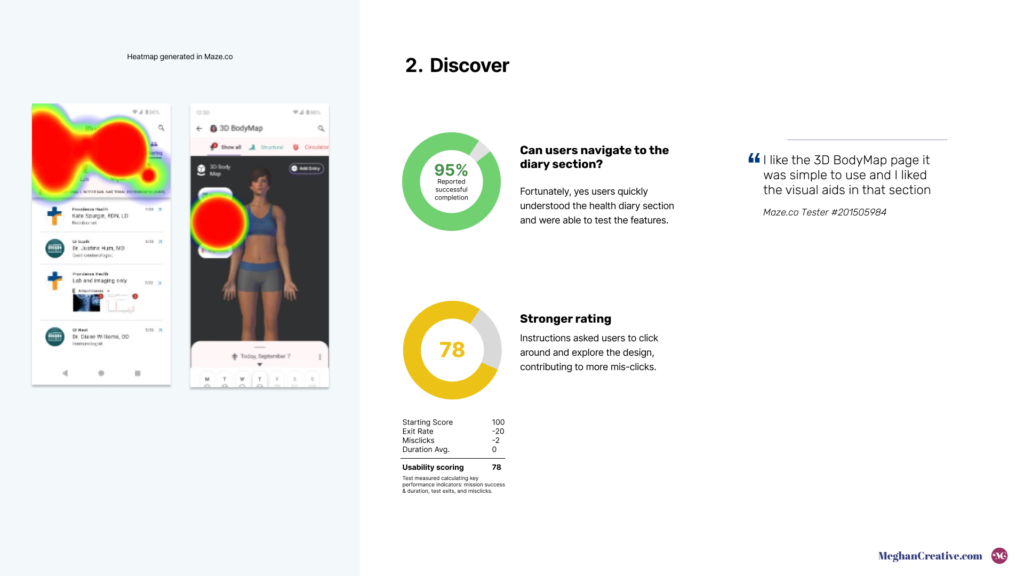
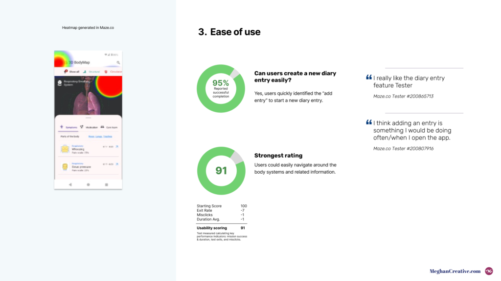
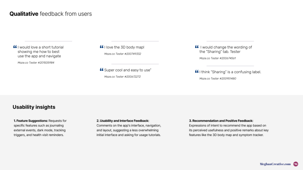
- Testing & Iteration: Conducted thorough usability testing via Maze.co; users responded positively to the diary feature while tests prompted revisions in the family navigation menu.
Outcomes
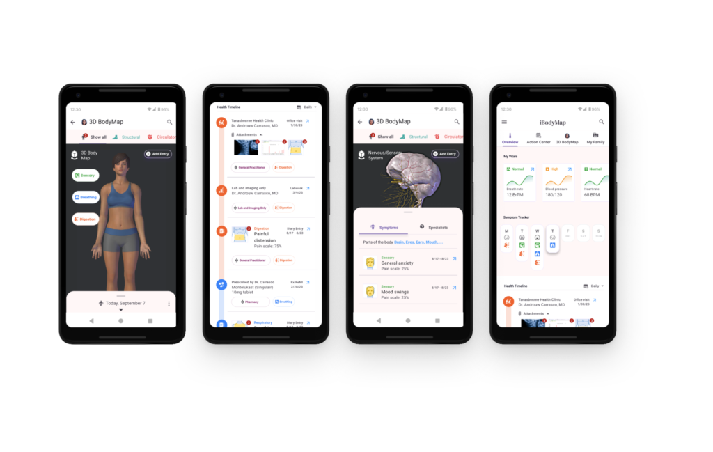
- Positive user feedback highlighted success with the diary entry feature and strong user engagement.
- Success measured by qualitative feedback and planned KPIs like new sign-ups.
- Lessons learned emphasized the importance of user-centered adjustments and precise navigation improvements.
Conclusion
- Effectively managed a solo UX project, resulting in an engaging health application that addresses key user challenges by combining empathy-driven insights with innovative design strategies.
- Set a foundation for improved app engagement and health management in future expansions.